Creating Simple Data Visualizations with Google Sheets
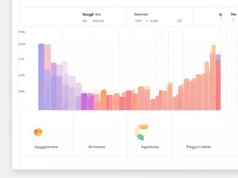
Google Sheets is a powerful tool that not only allows you to manage and analyze data easily but also create simple yet effective visualizations. Whether you are looking to create a pie chart, bar graph, or line chart, Google Sheets has got you covered. In this article, we will walk you through the steps to create simple data visualizations with Google Sheets.
Getting Started
To get started, you first need to have your data inputted into a Google Sheet. Once you have your data ready, select the range of data you want to visualize. Then, click on the "Insert" menu and select the type of chart you want to create. Google Sheets offers a variety of chart options to choose from, so select the one that best fits your data.
Customizing Your Visualization
Once you have inserted a chart into your Google Sheet, you can further customize it to suit your needs. You can change the chart type, add labels, change colors, and even adjust the axes to better represent your data. Experiment with different customization options until you are satisfied with the results.
Sharing Your Visualization
Once you have created and customized your data visualization, you can easily share it with others. Simply click on the "Share" button in the top right corner of your Google Sheet, and choose the sharing options that best suit your needs. You can share the visualization via a link, email, or even embed it on a website.
Creating data visualizations with Google Sheets is a quick and easy way to bring your data to life. Whether you are presenting to colleagues, clients, or just exploring your own data, Google Sheets offers a user-friendly platform for creating simple yet effective visualizations.


